Bedminster Remastered (Baywatch)
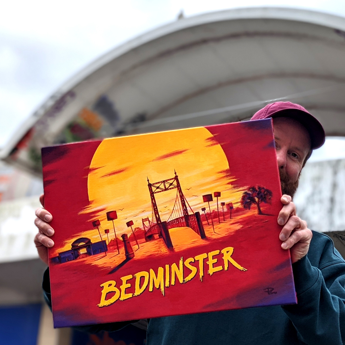
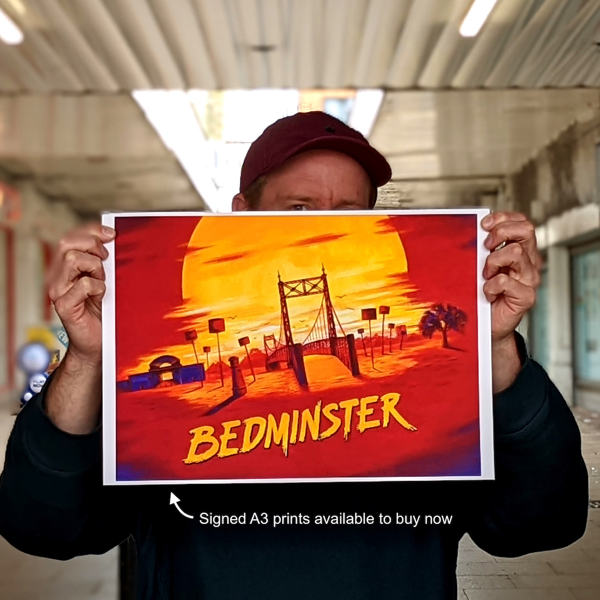
Acrylic on canvas. 53cm x 40cm
The art of a good parody is a delicate pursuit. I hand-painted this original image in the style and palette of the promotional artwork for Baywatch Remastered. I have a lot of affection for the cheesy 90s simplicity of Baywatch and I have fond memories of watching it as a child. Now that it's available to stream 24 hours I can regress as often as I need. In this tribute piece I have replaced every element from California's iconic Malibu beach with something from my local town of Bedminster.
Here's all the references in the image:
- St Catherine's Place shopping centre. Visible in the left of the image, this now practically derelict local landmark may soon lose it's iconic curved roof as it is marked for redevelopment. I am proud to have captured this moment in my 2022 painting while it still stands in it's current form.
- The ventilation ducts. Standing about 1 ½ m tall and dotted all around Bedminster, they look like tiny lighthouses and most people dismiss these as bollards but they are actually breather tubes to vent the various tunnels and shafts that lay underground. A reminder of Bedminster's coal mining history.
- Apple trees. As well as coal mines Bedminster was ripe with orchards. Until 1831 Bedminster was part of Somerset.
- Gaol Ferry Bridge. Smack bang in the centre of the painting is the most famous of bridges, what every tourist visiting Bristol wants to see, Geol Ferry bridge. Most people wrongly pronounce it as gow-el because the American spelling of the word "Jail" has practically replaced this old English spelling of a word for a prison. The bridge replaced the ferry boat that used to cross the new cut from the steps below.
- Towerblocks. On the right-side of the horizon is a tall towerblock of housing. There are many towerblocks around Bristol and I took care to include it after hearing a story of the tower blocks in Redcliff being digitally removed from a promotional photo.
- Estate agent signs. Malibu has imported palm trees swaying in the breeze, Bedminster has advertisements for property. The extraordinary story of rising house prices in Bristol is a very real thing and it's having a very real impact. I felt an internal pressure to remove these signs from my painting, afraid that they would be perceived as cynical or an unsavory topic for someone to want to hang on their wall. But somehow I also felt that removing them was even more cynical, like I was joining in the mass ignore. The truth is, if you grew up in Bedminster but cannot afford to buy property here as an adult, that's a shitty situation, but if you have managed to hustle enough cash to buy while still young then you should be proud of that achievement, not feel guilty. Gentrification is a fascinating topic which I feel people drastically oversimplify when talking about property because when people are really tested on their beliefs and values with a few hypothetical questions you actually find that most people surprise themselves with where they land on the political spectrum.
The lettering was also interesting. The name "Baywatch" only shares 2 letters with "Bedminster" so I had to derive an E, D, M, I, N, S and R in a style that matches. If you study the Baywatch logo closely you'll also notice the letters also don't follow a consistent angle, they flare out, slanting more at the beginning of the word but sitting more upright by the end. Mimiking this style was a fun typography / graphic design challenge.